Exploring a refreshed user experience for Maybelline’s U.S. website


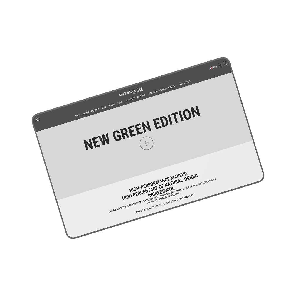
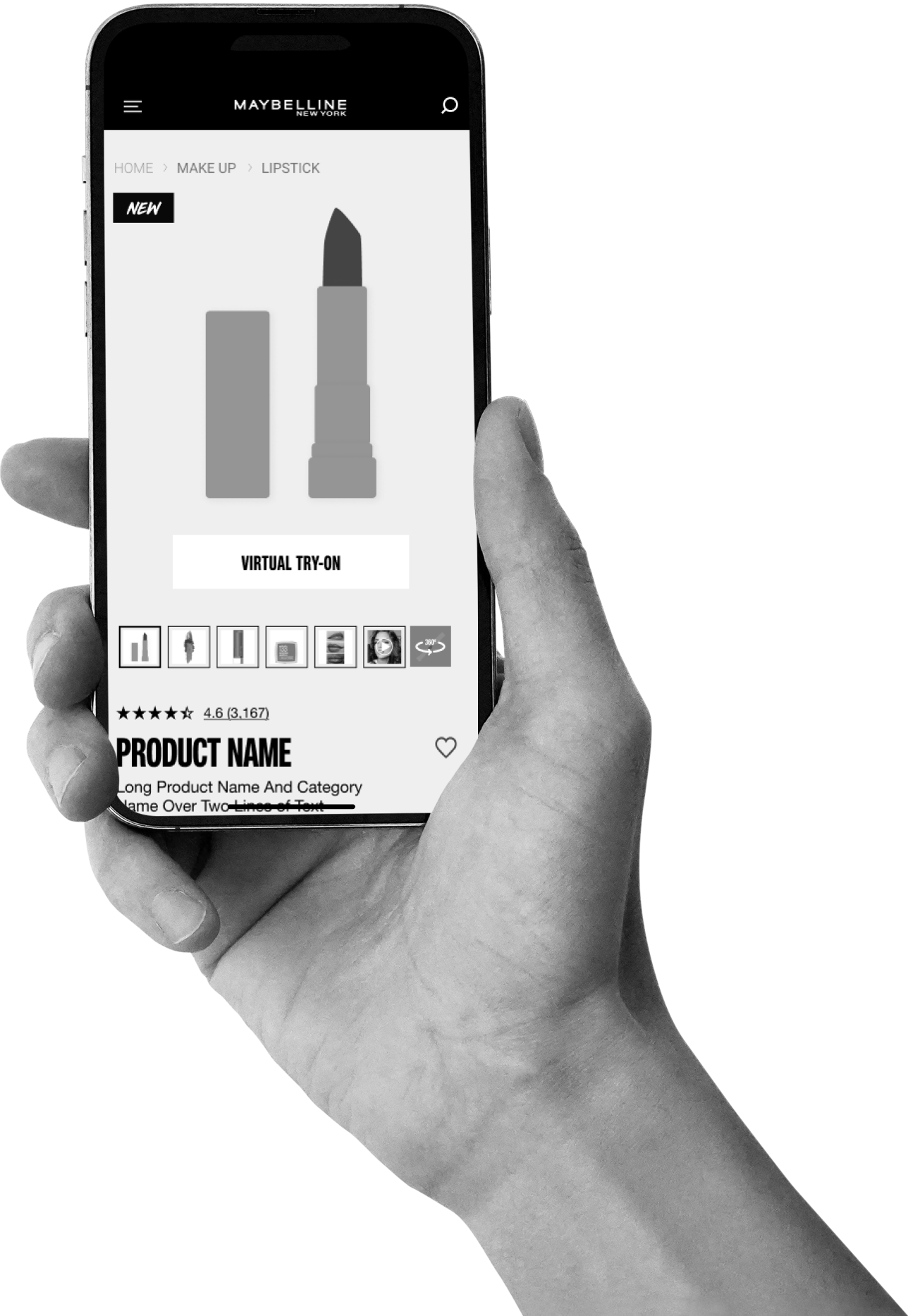
Maybelline New York set out to refresh the UX of their U.S. website, aiming to modernize the interface while staying aligned with their global brand identity. We were brought in by AnalogFolk to assist with low-fidelity design exploration, helping the team define a more consistent, intuitive experience. The project involved improving layout clarity, addressing inconsistencies, and experimenting with product page structures that could scale across collections.

UX/UI Design
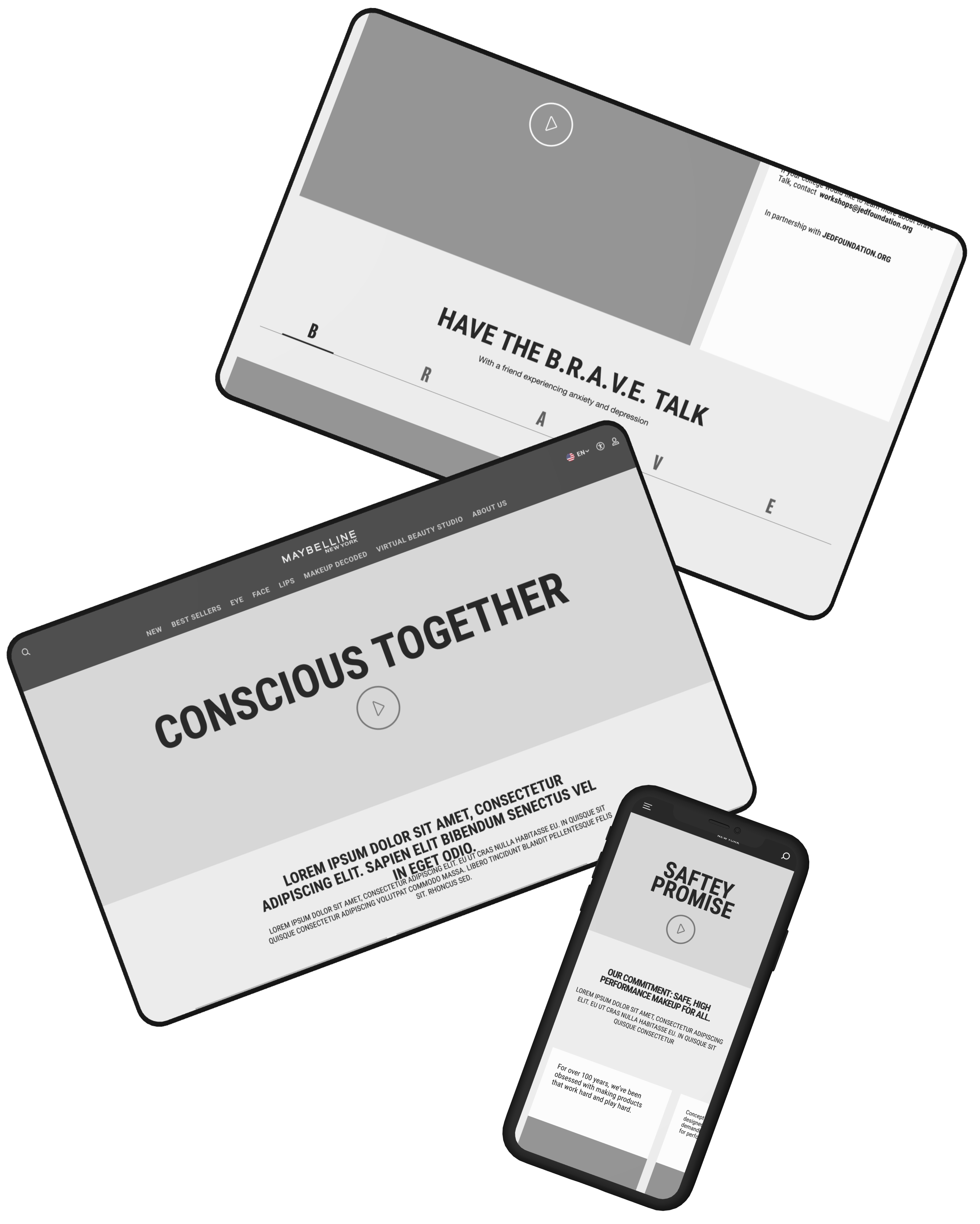
We collaborated with AnalogFolk to structure Maybelline’s UX through targeted wireframe sprints and iterative feedback. The work focused on campaign and PDP layouts, laying the groundwork for a scalable design system the visual team would later build upon.

UX audits and competitor benchmarking

Wireframe exploration for PDP and campaign pages

Modular layout system for scalability

Daily feedback and design iteration

Annotations for seamless Visual Design handoff

Structured templates for site-wide consistency

Highlights
We analyzed websites from brands like Fenty, L’Oréal, and Clinique to identify design patterns and industry trends that informed our layout decisions.

Highlights
We proposed multiple layout structures for product collections, franchise pages, and campaign initiatives like Brave Together and Conscious Together, designed to be adaptable and scalable.

Highlights
Daily feedback loops with AnalogFolk helped us iterate efficiently, aligning with Maybelline’s branding while resolving UX pain points quickly.

Over two months, we helped establish a modernized UX foundation for Maybelline NY’s U.S. website. Our low-fidelity work was crucial in aligning stakeholders around structure, hierarchy, and user flow before entering high-fidelity design. The client approved the proposals, which were later implemented on their live website improving navigation, responsiveness, and content clarity.
Let's Talk
Tell us what you’re working on we’ll jump in where it matters most.
Get in touch