Helping a fast-growing team scale their design efforts with a modular, Figma-based component system

Web

Technology & SaaS

4 weeks

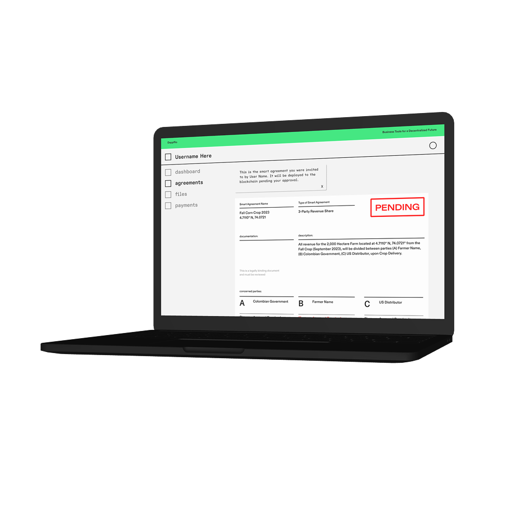
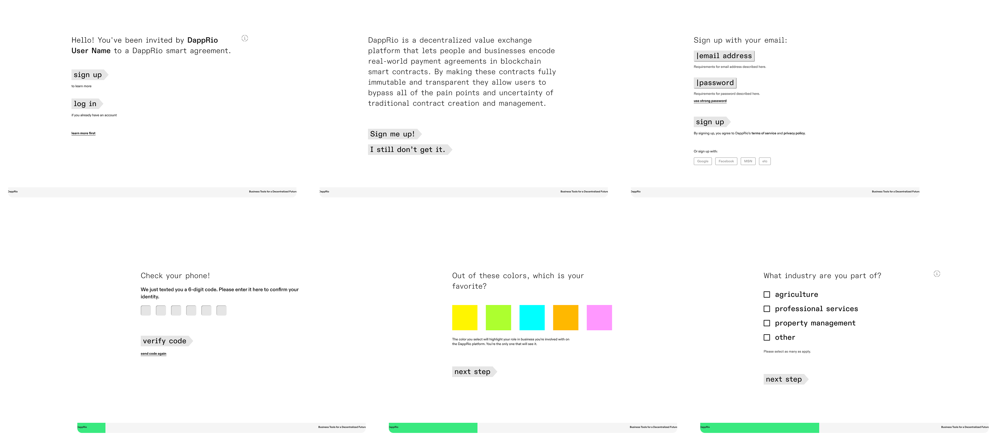
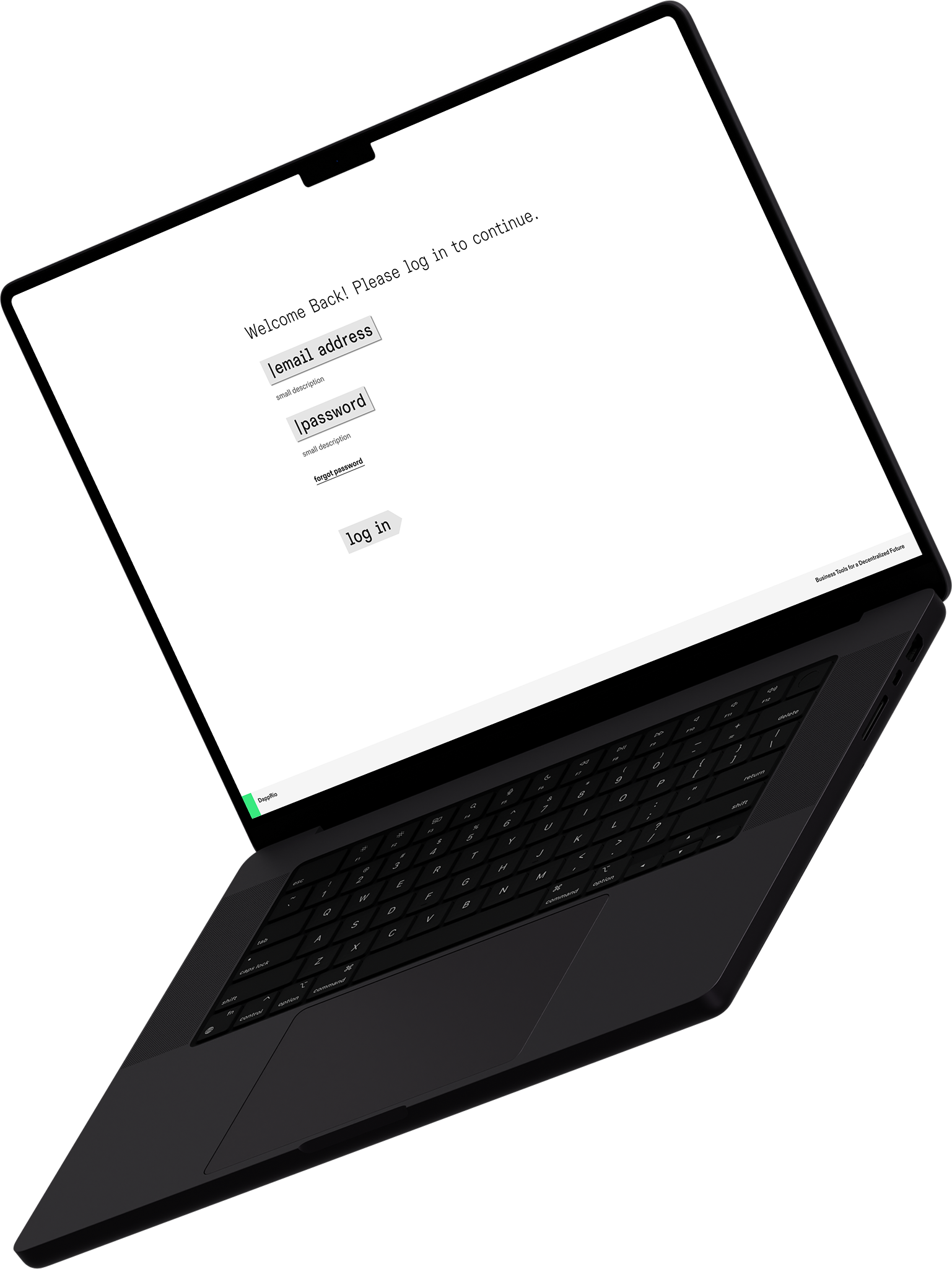
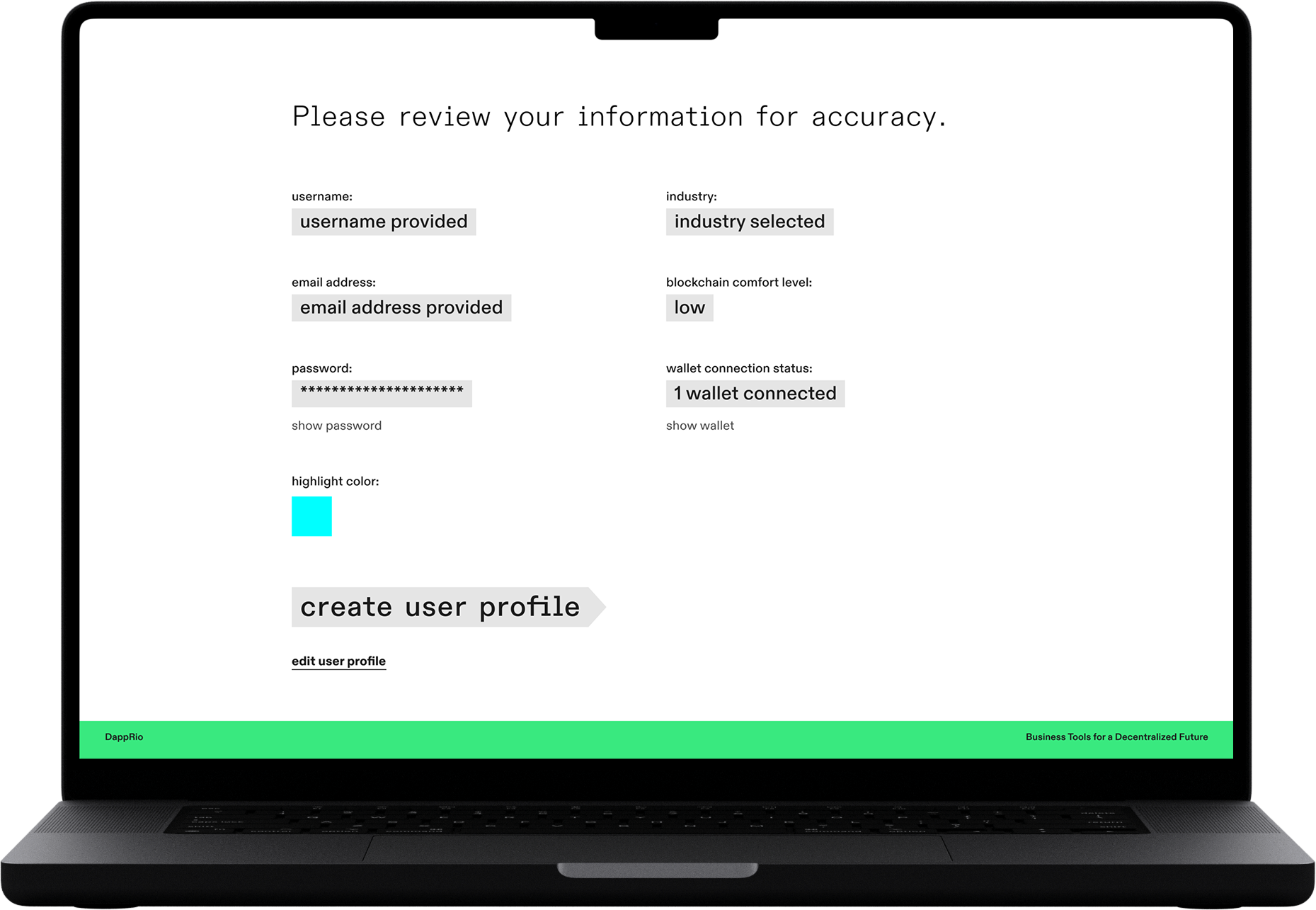
DappRio reached out with an urgent need to standardize their design system in Figma and create a working prototype for stakeholder presentations. Their internal design team was new to Figma and lacked reusable foundations, which led to scattered UI decisions and misalignment across flows. Our role was to rebuild the core design structure, improve the UX of critical screens like the login and registration flow, and set up a usable interactive prototype.
.svg)
UX/UI Design
Visual Design
Interaction Design
Prototyping
Design Documentation
We worked closely with DappRio’s internal team to improve structure, reusability, and overall UX maturity. By auditing their Sketch-to-Figma transition, we identified missing foundational elements and guided their team through proper component usage and scalable design practices.

Rebuilt foundational UI elements in Figma
Reviewed and improved login + registration UX
Created interactive prototype for stakeholder demos
Modularized layout and components for reusability
Delivered optimized Figma file with annotations

Highlights
We replaced fragmented elements with scalable components, enabling faster updates and consistent design language across the platform.
Highlights
Reworked the user flow to improve clarity, form input hierarchy, and edge case handling, critical for first-time user adoption.
Highlights
Built a click-through prototype that showcased the redesigned flow in action ready for leadership review and internal alignment.
.png)
The engagement with DappRio was short but high impact. Within a one-month sprint, we rebuilt their Figma foundations, redesigned core screens, and equipped their team with a ready-to-demo prototype. Our work enabled them to present confidently to stakeholders and scale their system independently moving forward.
Let's Talk
Tell us what you’re working on we’ll jump in where it matters most.
Get in touch


